When a painting feels “flat”, most people blame their drawing or their choice of colours. They may think they chose the wrong shade of blue, that their drawing wasn’t accurate enough or just that their painting lacks a sense of depth.
Very often, the real issue isn’t colour or drawing at all.
It’s the Values.
Values are essentially the pattern of light, mid-tones, and darks across the painting. Once you start paying attention to value (how light or dark something is), your paintings will gain depth, atmosphere, and focus regardless of the colours being used.
What Are “Values” in Watercolour?
- Light values: pale washes, lots of water and very gentle colour
- Mid values: medium-strength washes, often the “body” of the painting
- Dark values: stronger mixes, less water, create drama and depth
Balancing all three is the key to a good painting. If you only have light and mid values, the end result can feel weak. A painting with a good range of values will feel more solid and convincing.
Terry Harrison’s landscapes and Fiona Peart’s florals both rely on this. Even with soft colours, the value structure is clear.
Why do Values matter more than colour?
If the value pattern is strong, the painting will usually work—even with unusual colours. If the value pattern is weak, the painting will struggle, no matter how complementary the colours are.
- If the tree is darker than the sky, it reads as a clear shape.
- If the tree and sky are almost the same value, the tree will disappear.
This is why some paintings feel “flat”. When everything is in the same middle value, there’s no contrast.
A Simple Exercise With One Colour
Choose a darker paint and a round brush. Pick a simple subject and paint it using only that one colour, varying just the amount of water. Focus on the lights and darks, not colour. Use pale washes for light areas, medium washes for mids, and strong shades for darks.
Tip: Let lighter areas dry before moving to mid and dark values.
When you look at your study, you’ll see more contrast, depth, and drama—this is value at work.
Common Value Problems (and Fixes)
1. Everything is mid-tone - If everything blends together, you may lack contrast.
- Fix: Deepen key areas with stronger paint. Darken shadows, especially near the focal point.
2. Losing the lights - Over-layering washes can lose the white paper.
- Fix: Decide on your lightest areas before starting and protect them. Mask or paint around them to keep them light.
3. Dark in the wrong place - Darkest darks scattered or in the background can feel heavy.
- Fix: Keep strongest darks near the focal point. Lighten background darks for depth.
How Terry and Fiona Use Values
Would you like to see some examples?
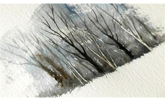
In Terry’s Painting Trees Video, at 14:20, he paints a copse of trees showing the power of Values:
Watch here
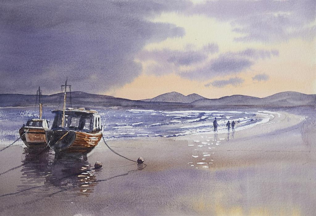
In "After the Storm," darker values around the boats make them pop, while lighter values towards the horizon add depth.
You can watch "After the Storm" for free until the end of December.
If you’d like your paintings to feel deeper and more “finished” without changing all your colours, visit the Terry Harrison film library or Fiona Peart’s courses and try a one-colour value study. You’ll be amazed at the difference value can make!
Happy Painting,
Martin