Trees That Flatten the Scene
Trees are one of the quickest ways to add character to a landscape… but they’re also one of the quickest ways to accidentally flatten it. If your trees sometimes look like they’re sitting on top of the scene (rather than sitting in it) it’s usually because everything has ended up the same value, the same edge or the same shape. What’s it all about? “Sticker trees” usually happen when we do one (or more) of these: - paint every tree as an individual object (instead of a group/mass)
- use the same green/value for near trees and far trees
- give everything a hard edge
- add detail everywhere (so nothing is allowed to sit back)
The fix is to think in masses first, then use value stepping to create distance. The simple fix (that works in almost every landscape) 1) Mass first, detail second Before you think “branches” or “leaves”, try to see the treeline as a single shape. Paint that shape first. Then, only when it’s dry, add a few selective marks where you want the eye to go. 2) Value-step your trees for depth A really helpful rule: - Far trees: lighter, softer, slightly cooler/duller
- Mid trees: medium value, a few clearer edges
- Near trees: darkest darks, sharpest accents
If your distant trees are too dark, they’ll jump forward and everything will feel compressed. 3) Vary the silhouette Trees look more natural when the top edge isn’t repetitive - Nature is random so introduce some chaos into your tree outlines. Even in a simple treeline, you could try: - a few taller peaks
- a few dips
- some broken gaps.
4) Use negative painting for light and gaps Instead of outlining branches or painting every leaf, try lifting out a few lighter gaps. Those little breaks suggest light and air and help to stop the treeline becoming a solid wall. Fancy giving it a try? - Paint three quick treelines (small rectangles is fine):
- Far treeline: light value + soft edge.
- Mid treeline: medium value + a few clearer edges.
- Near treeline: darkest value.
- Then add only 5 detail marks to the near treeline.
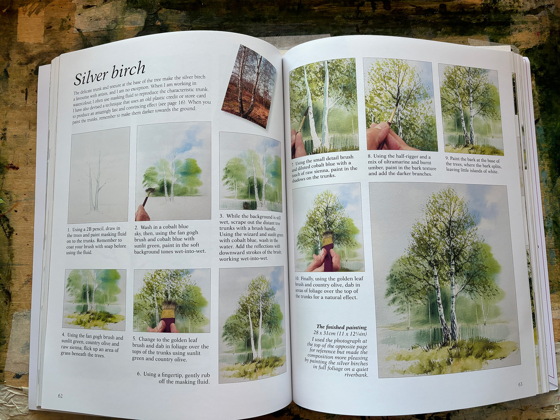
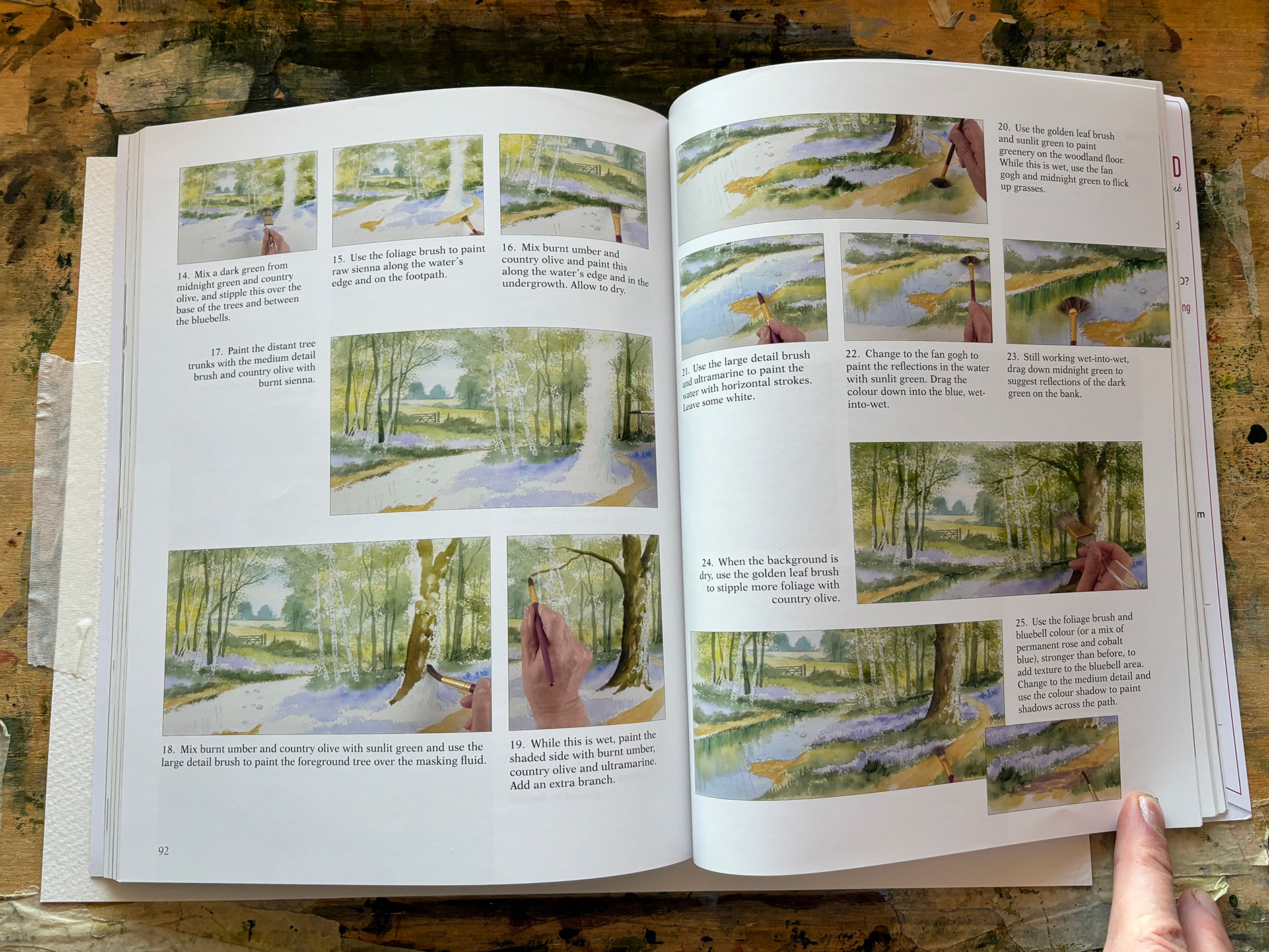
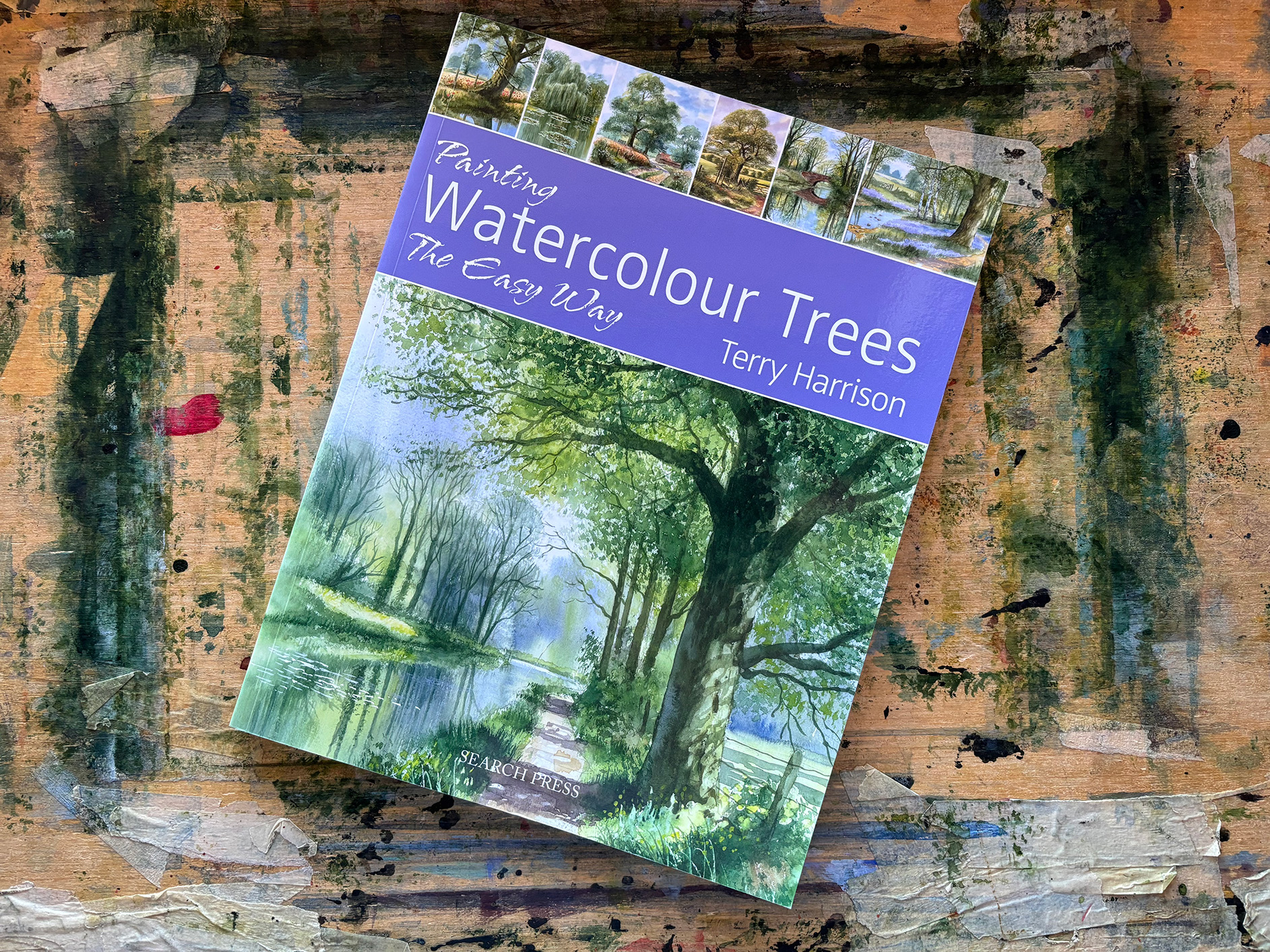
Terry was somewhat of a specialist when it came to trees - you can find some great hints on painting tree here or if you prefer to have a reference point, you can find a Masterclass in painting trees in the form of Terrys Book Painting Watercolour Trees. 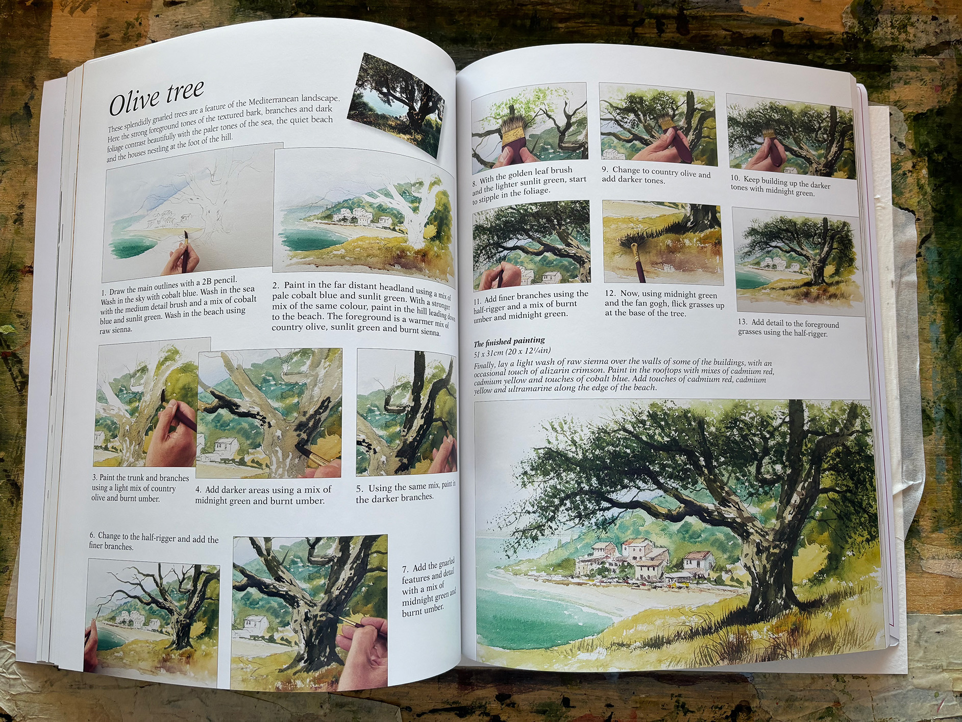
Please do let me know how you get on if you have a go — you can share it on our Facebook group which you can access using the link below!
https://www.facebook.com/groups/507681213309249/ If you’d like to see a step-by-step demo, you can browse our full video library here:
https://www.terryharrisonart.com/videos/ For a Masterclass in painting trees you can check out Terrys books all about painting trees in Watercolour: Happy Painting
Martin
|