Skies That Look Streaky or Flat Skies are one of those things that look simple, especially when you watch Terry effortlessly produce one, but then you try to paint one yourself... A watercolour sky that looks flat or streaky is incredibly common. But the good news is that it’s usually caused by just a couple of small (and crucially fixable!) habits. What’s it all about? Skies are basically a series of big, simple washes. That means they’re less forgiving than small shapes, because you can see every hesitation. Streaky skies tend to come from either: - Not enough paint/water in the brush (so the wash runs out part-way)
- Chasing edges as the paper dries (which creates bands and hard marks)
- Going back in too much (overworking)
When putting down a sky the goal isn’t to paint a “perfect” sky, rather to achieve a clean, believable wash that supports the rest of the painting. 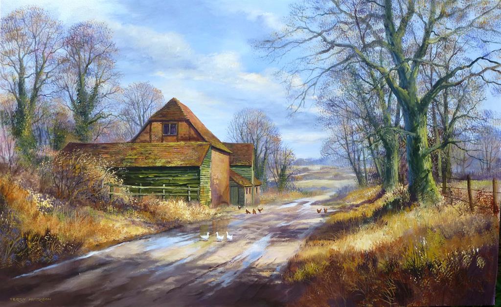
one of Terrys Classics with a confident and autumnal sky A simple approach that works 1) Pre-wet the area (lightly) or commit to a confident wash If you like working wet-in-wet, a light pre-wet can help the colour travel evenly. If you prefer wet-on-dry, that’s fine too — the key is to keep the wash moving. If you have watched some of Terrys Videos then you will see that he often favours the wet in wet approach, using the Golden Leaf to wet the area with water before applying the first wash. If you'd like to see that in action you can watch Terry here in his free video on Lifting Out - fast forward to 05:00 and you can watch him put down a quick sky! 2) Load more than you think you need A sky wash often fails because we run out of paint in the brush and then try to “patch” it. It’s better to mix a little more than you think you’ll need, so you can keep the wash consistent. The key here is to have a brush that can hold a decent amount of water and paint - This is where Terrys Foliage range comes in, with sizes from the large Golden Leaf (1.2 inch) and slightly smaller Summer foliage (1 inch) to the Spring Foliage (3/4 inch) for those smaller scenes. 3) One direction, one pass (then stop) Try to avoid brushing back and forth. Lay it in, keep a small bead moving, soften only where you truly need to and then leave it. 4) Lift for light (don’t paint white clouds) If you want lighter cloud shapes, it’s often easier to: - put down the wash,
- wait until it’s satin (soft sheen),
- then lift gently with a damp (not wet) brush or tissue.
That gives you softness without hard outlines. The video linked above shows Terry doing just this to create a wonderful could scene. Fancy giving it a try? - Paint three sky strips (just small rectangles):
- Strip 1: a simple gradient (darker at the top, lighter at the bottom).
- Strip 2: the same gradient, then lift a couple of soft cloud lights.
- Strip 3: add a tiny touch of warmth near the horizon (very subtle).
- The key rule: once each strip is down, don’t go back in unless you’re lifting at the satin stage.
Please do let me know how you get on if you have a go — you can share it on our Facebook group. If you are not a member and want to join the community then just use the link below and request access! https://www.facebook.com/groups/507681213309249/ If you’d like to see a step-by-step demo, you can browse our full video library here:
https://www.terryharrisonart.com/videos/ Happy Painting
Martin
|